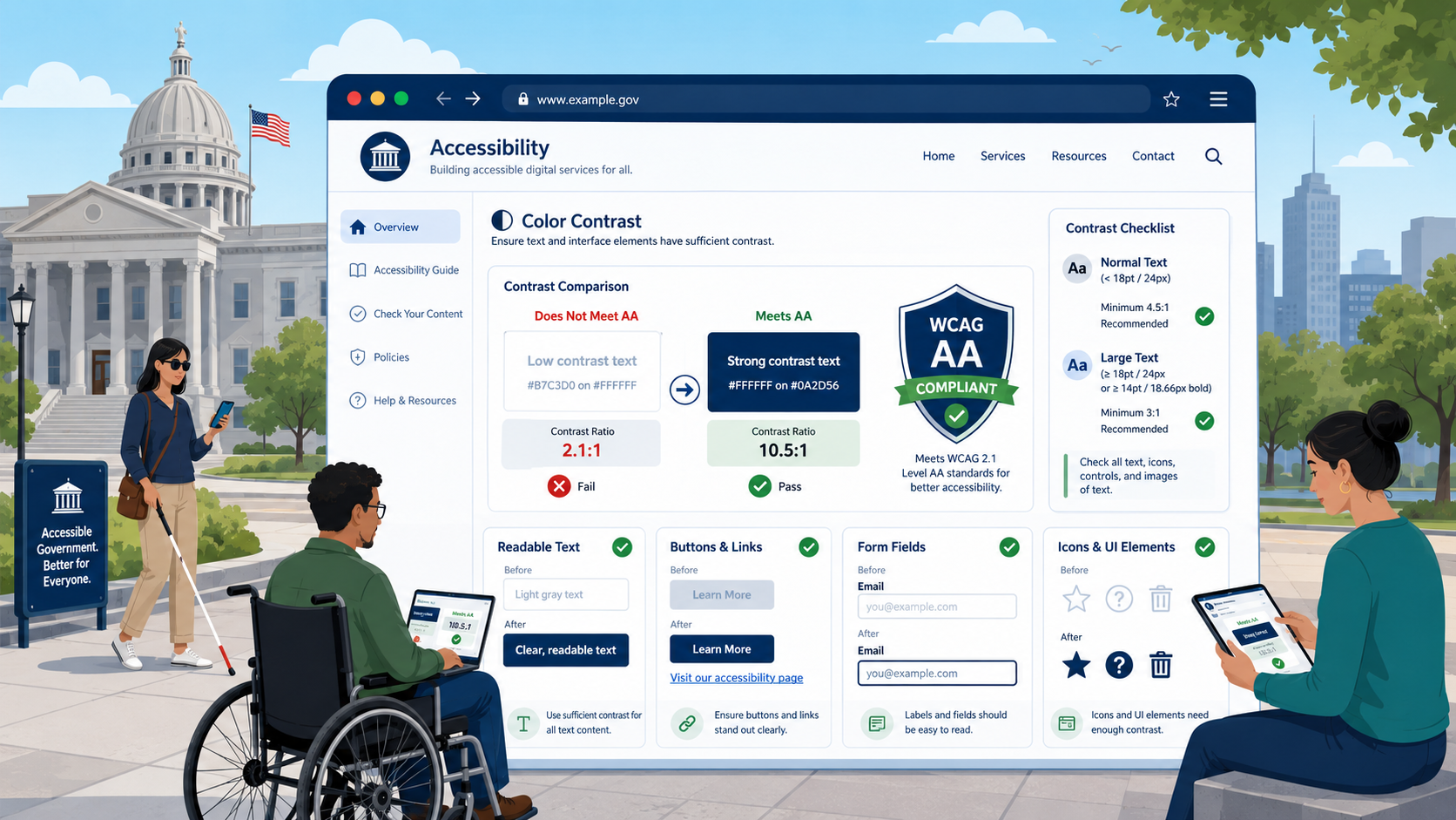
TL;DR: WCAG 2.1 Level AA requires text to have a 4.5:1 contrast ratio against its background (3:1 for large text), and requires UI components and graphical objects to have a 3:1 ratio. These are bright-line numbers. Government brand palettes — often defined decades ago for print — fail these thresholds constantly, especially on hover states, focus indicators, placeholder text, disabled controls, and links inside body copy.
Color contrast is one of the most consistently failed accessibility requirements on government websites, and one of the most consistently catchable. The math is straightforward, the tools are free, and the remediation usually involves changing a few hex values. This guide covers what the WCAG contrast criteria require, where government sites most often fail, and how to fix it without abandoning your visual identity.
The Two Criteria You Need to Know
WCAG 2.1 Level AA includes two contrast-related success criteria. Both are required under the DOJ’s 2024 ADA Title II rule.
1.4.3 Contrast (Minimum) — Level AA
Text and images of text must have a contrast ratio of at least:
- 4.5:1 for normal text
- 3:1 for large text (18 point or larger, or 14 point bold or larger — roughly 24px regular or 19px bold in CSS)
Exceptions: incidental text (text in inactive UI components, decoration, text within an image that is not essential), text in a logo or brand name, and text that is part of a picture containing other significant visual content.
1.4.11 Non-text Contrast — Level AA
User interface components and graphical objects must have a contrast ratio of at least 3:1 against adjacent colors.
This covers:
- Form input borders (against the surrounding page)
- Button borders or fills (against the surrounding page)
- Icons used to convey meaning
- Focus indicators
- Required-field indicators
- Hover and active state changes that convey information
- Chart elements where color carries meaning
Exceptions: components that are disabled, components whose appearance is controlled by the user agent and not styled by the author, and parts of graphics not required to understand the content.
A Note on AAA
WCAG includes a higher contrast tier (1.4.6 Contrast Enhanced) requiring 7:1 for normal text and 4.5:1 for large text. AAA is not required by the DOJ rule or by Section 508. Many agencies target it for body text anyway because it improves legibility for older adults and outdoor mobile use.
How Contrast Is Calculated
The contrast ratio is computed from the relative luminance of two colors. The formula is defined in WCAG and produces a number between 1 (no contrast) and 21 (pure black on pure white). You do not need to do the math by hand — every tool does it for you.
What matters conceptually:
- Contrast depends on the actual rendered colors, including any transparency
- Background images and gradients complicate measurement — test the worst case
- Anti-aliasing means edge pixels are not the same color as the named foreground; tools handle this
- “Contrast” in the WCAG sense is not the same as the contrast slider in image-editing software
How to Measure Contrast
Several free tools, in approximate order of utility:
Browser DevTools
Modern Chrome, Edge, and Firefox DevTools display contrast ratios in the color picker when you inspect any element. This is the fastest way to check a single element on a live page. Chrome and Edge also display a contrast curve that shows what colors would pass at the current background.
Colour Contrast Analyser (CCA)
Free desktop application from TPGi (formerly The Paciello Group) for Windows and macOS. Includes an eyedropper that samples colors from anywhere on screen, useful for testing PDFs, images of text, and complex backgrounds. The de facto standard for contrast testing in professional audits.
WebAIM Contrast Checker
Browser-based tool at webaim.org/resources/contrastchecker/. Useful for testing color pairs without installing anything.
axe DevTools
The axe browser extension reports contrast failures across an entire page during automated scanning. Best for finding failures site-wide; less useful for testing a specific element.
Lighthouse
Built into Chrome DevTools. Reports contrast failures as part of the broader accessibility scan.
For a real audit, use multiple tools. Automated tools have known blind spots (text over background images, text on gradients, dynamically generated colors, text inside SVGs) where manual sampling with CCA is required. See our accessibility audit guide for the broader testing methodology.
Where Government Sites Commonly Fail
Across hundreds of government website audits, the same contrast failures appear repeatedly.
Brand Colors That Don’t Meet AA
Many government brand palettes were defined for print media decades before WCAG existed. A common pattern: a “primary blue” hex value chosen for the printed seal that produces a 3.8:1 contrast ratio when used for body text on white. That fails 1.4.3 by a small margin but fails nonetheless.
The fix is usually not to abandon the brand but to define web-safe shades within the brand family. The US Web Design System (USWDS) is a useful reference: it explicitly documents which of its color tokens pass which WCAG criteria and at what use.
Light Gray Body Text
The aesthetic preference for “softer” body text — #999, #BBB, #CCC — almost always fails. Body text against white background needs to be at most #767676 (a 4.54:1 ratio) at 16px to pass 1.4.3. Anything lighter fails.
Placeholder Text in Form Fields
Default browser placeholder text is light gray and frequently fails. The fix is to set a darker placeholder color in CSS — and to remember that placeholder text is not a substitute for a visible label, which is required by other WCAG criteria regardless of contrast.
Disabled Controls
WCAG explicitly exempts disabled components from 1.4.11, but if the disabled state is visually indistinguishable from the enabled state, you have a different failure (1.3.3, 1.4.1). And if disabled controls communicate information the user needs (which step is complete, which option is unavailable), color alone cannot carry that information.
Hover and Focus States
A button at rest may pass, but the hover state changes the background to a different color and the new combination fails. Test every interactive state, not just the default.
Focus Indicators
A 2px gray outline against a slightly different gray background is a common failure of 1.4.11. Focus indicators must have 3:1 contrast against the unfocused state and against the adjacent background.
Required-Field Asterisks
A red asterisk against a white background often passes 1.4.3 because red has reasonable luminance contrast against white. But a light pink asterisk does not. And if the asterisk is the only indication that a field is required, you have a 1.4.1 failure regardless of its color contrast.
Links Inside Body Copy
WCAG includes a specific requirement (1.4.1 Use of Color) that links be distinguishable from surrounding text by more than color alone. A blue link in black body text needs either an underline, a 3:1 contrast difference between the link color and the surrounding text color, or both. Many “modern” designs strip underlines, leaving only color to distinguish links — a 1.4.1 failure.
Icons Without Text
A 16px gray icon on a white toolbar may carry meaning (filter, sort, expand). Under 1.4.11, the icon’s meaningful pixels need 3:1 contrast against the toolbar background.
Chart Colors
Pie charts, bar charts, line charts where category is encoded only by color frequently fail both 1.4.11 and 1.4.1. The fix combines higher-contrast palettes, direct labeling of data series, and patterns or textures to distinguish categories.
Buttons Without Borders
A “ghost button” — text inside a colored rectangle with no border — depends on the rectangle’s fill having 3:1 contrast against the page background. Buttons with only a thin border fail when the border itself fails the 3:1 requirement against the page.
How to Remediate
A practical remediation sequence:
Step 1: Inventory the Palette
Document every color used in the site’s design system: page background, surface backgrounds, primary text, secondary text, link, link hover, link visited, primary button, secondary button, border, divider, error, warning, success, info, focus, and any chart colors. Most agencies discover their actual deployed palette is much larger than their documented brand palette.
Step 2: Test Every Combination Actually Used
You only need to test combinations that occur on the site. Build a contrast matrix: which foreground colors appear over which background colors. Test each combination.
Step 3: Adjust Within the Brand
For each failing combination, find the nearest passing color within the brand family. Usually this means darkening a text color or shifting a saturation. Most agencies can resolve 80 percent of contrast failures by adjusting four to six color tokens.
Step 4: Add Pattern Where Color Is Insufficient
For charts, status indicators, and required-field markers, add a non-color cue: a pattern, an icon, a text label. This satisfies 1.4.1 and improves usability for everyone.
Step 5: Codify in the Design System
Update the design system, the CSS variables, the documentation, and the brand guidelines. Without this step, the next redesign reintroduces the same failures.
Step 6: Add to Monitoring
Contrast regressions appear constantly — a content editor pastes inline styling, a new campaign launches with off-brand colors, a vendor pushes a CSS update. Continuous scanning catches these before they accumulate.
A Note on Dark Mode and Theming
Many agencies are adding dark mode or user-selectable themes. WCAG contrast requirements apply to every theme separately. A site that passes 1.4.3 in light mode and fails in dark mode is not conformant. Test every theme.
If you offer a high-contrast mode as an accommodation, that does not satisfy the requirement that the default mode meet WCAG. The default mode must conform on its own; alternatives are additional.
Tying It Together
Color contrast is rarely the biggest accessibility problem on a government website, but it is one of the most visible, one of the easiest to find, and one of the most catchable in DOJ and OCR investigations. It is also a leading indicator: agencies that fail basic contrast are usually failing other criteria too. Solving contrast often solves a broader design-system hygiene problem that improves the rest of the WCAG 2.2 Level AA checklist.
How Govzu Helps
Govzu continuously scans every page of your government website for WCAG 1.4.3 and 1.4.11 contrast failures, including the dynamic states (hover, focus, active, disabled) that one-time audits routinely miss. The platform reports failures against the specific success criterion, identifies the design tokens involved, and tracks contrast regressions as content editors and vendors push changes — so the design system you remediate in 2026 stays compliant as the site evolves.