TL;DR: Every interactive element on a government website must be operable using only a keyboard. That means visible focus indicators, a logical tab order, working skip links, no keyboard traps, and accessible menus and modals. WCAG 2.2 success criteria 2.1.1, 2.1.2, 2.4.3, 2.4.7, and 2.4.11 are the legal baseline most US public agencies will need to meet under the DOJ’s 2024 ADA Title II rule. Test by unplugging your mouse and using only Tab, Shift+Tab, Enter, Space, and arrow keys.
Keyboard accessibility is one of the oldest and most well-understood areas of web accessibility, and it is also one of the most frequently broken on government websites. People who use screen readers, switch devices, voice control, head pointers, sip-and-puff systems, or who simply cannot use a mouse because of tremor, repetitive strain injury, or limited mobility, all rely on a keyboard interface (or an assistive technology that emulates one).
If your government website cannot be navigated with a keyboard alone, it is not accessible. And under the Department of Justice’s 2024 ADA Title II rule, keyboard accessibility is a non-negotiable part of WCAG 2.1 AA conformance for nearly every state and local government in the United States.
This guide walks through the WCAG success criteria that govern keyboard accessibility, the most common failures we see on public-sector sites, and how to test and fix them.
Why Keyboard Accessibility Matters for Government
Government websites are different from commercial sites in one critical way: people cannot choose a competitor. If a resident cannot renew a license, pay a property tax bill, apply for benefits, or read a public notice because the page does not work with a keyboard, the agency has effectively denied them a government service.
That is the legal core of ADA Title II’s “equal access” requirement, and it is why keyboard operability shows up in essentially every accessibility complaint the DOJ investigates. It is also why keyboard navigation is the first thing most accessibility auditors test - it is fast to evaluate, it surfaces problems quickly, and it correlates strongly with overall accessibility quality.
The WCAG Success Criteria You Need to Know
WCAG 2.1 and WCAG 2.2 define five core success criteria that together cover keyboard accessibility. All five are Level A or AA and are part of the conformance target for ADA Title II.
2.1.1 Keyboard (Level A)
Every function of the page must be operable through a keyboard interface, without requiring specific timings for individual keystrokes. There is an exception for inputs that depend on a path (like signing your name), but otherwise: if a mouse user can do it, a keyboard user must be able to do it too.
2.1.2 No Keyboard Trap (Level A)
If keyboard focus can be moved to a component using a keyboard, it must also be possible to move focus away using only a keyboard. Modals that capture focus and refuse to release it, embedded media players that swallow the Tab key, and custom date pickers that trap arrow keys are all common violations.
2.4.3 Focus Order (Level A)
When the user navigates sequentially with Tab, focus must move in an order that preserves meaning and operability. A form whose tab order jumps from the first field to the submit button and then back through the rest of the fields is failing this criterion, even if every individual element is reachable.
2.4.7 Focus Visible (Level AA)
Any keyboard-operable user interface must have a visible focus indicator. The default browser outline meets this requirement, which is why the line *:focus { outline: none; } is one of the most common accessibility violations on the web. If you remove the default focus ring, you must replace it with something at least as visible.
2.4.11 Focus Not Obscured (Minimum) (Level AA, WCAG 2.2)
New in WCAG 2.2, this criterion requires that when a component receives keyboard focus, it is not entirely hidden by author-created content like sticky headers, cookie banners, or chat widgets. Partial obscuring is allowed; complete obscuring is not.
The Building Blocks of Keyboard-Accessible Pages
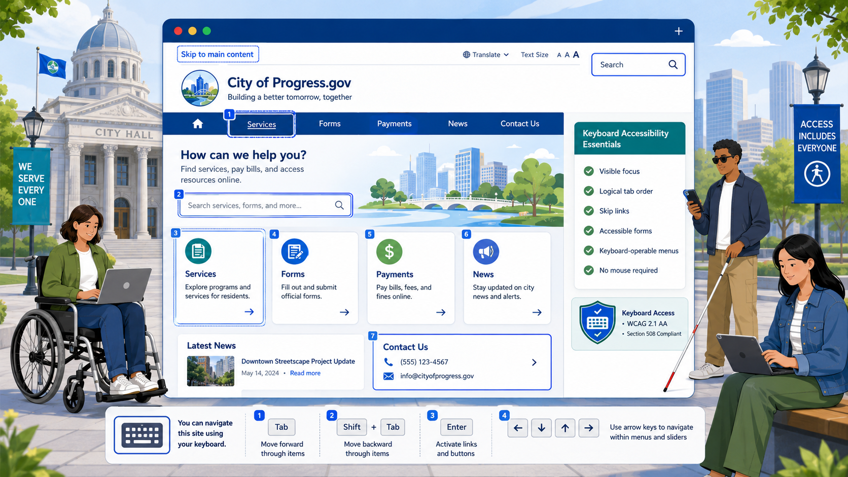
Skip Links
A “Skip to main content” link is the single most impactful change a government site can make for keyboard users. Without one, a screen reader user or keyboard-only user has to tab through every navigation link, every utility menu, every language switcher, every search field, and every social link on every page before reaching the content they came for.
The skip link should be the first focusable element on the page. It can be visually hidden until focused, but it must become visible when it receives keyboard focus.
<a class="skip-link" href="#main-content">Skip to main content</a>
.skip-link {
  position: absolute;
  left: -9999px;
}
.skip-link:focus {
  left: 1rem;
  top: 1rem;
  z-index: 1000;
  background: #fff;
  padding: 0.5rem 1rem;
  outline: 3px solid #005ea2;
}
For sites with complex layouts, multiple skip links (skip to navigation, skip to main, skip to footer) can be even more helpful.
Logical Tab Order
Tab order should follow the visual reading order of the page. In most cases this is automatic: if your HTML source order matches your visual order, the browser handles tab order correctly. Problems arise when CSS reorders content - particularly with flex-direction: row-reverse, order properties, or absolutely positioned elements that visually appear before content that comes earlier in the DOM.
Avoid using tabindex values greater than zero. A positive tabindex removes elements from the natural tab order and inserts them at the front of the document, which almost always creates a confusing experience. Use tabindex="0" to make a non-interactive element focusable when needed, and tabindex="-1" to make an element programmatically focusable (for example, to move focus to a heading after a route change in a single-page app).
Visible Focus Indicators
Browsers ship with default focus indicators, but they are often subtle and inconsistent across browsers and elements. A robust government site should define its own focus styles that meet or exceed the 3:1 contrast requirement from WCAG 1.4.11 (Non-text Contrast).
:focus-visible {
  outline: 3px solid #1a4480;
  outline-offset: 2px;
}
Using :focus-visible instead of :focus lets you show the indicator for keyboard users while suppressing it for mouse clicks, which is a common design preference. Make sure your focus indicator works on every background color in your design system, including dark headers and brand-color buttons.
Keyboard-Operable Menus
Dropdown menus, mega menus, and disclosure menus must all be operable from the keyboard. The W3C’s ARIA Authoring Practices Guide describes two common patterns:
- Disclosure menus, where the menu button toggles a submenu and Tab moves between menu items.
- Menubar menus, where arrow keys move between top-level items and Enter or Down arrow opens a submenu.
For most government sites, the disclosure pattern is simpler, more accessible, and easier to maintain. Whichever pattern you choose, the menu must be:
- Operable with the keyboard (Enter, Space, arrow keys as appropriate).
- Closable with Escape.
- Properly labeled with
aria-expandedto communicate state. - Visible when focused, including any submenu items.
Accessible Modals and Dialogs
Modals are one of the most common sources of keyboard accessibility failures. A properly built modal must:
- Move focus into the modal when it opens (typically to the first focusable element or to the modal container itself).
- Trap focus inside the modal until it is dismissed. Tab from the last element should wrap to the first; Shift+Tab from the first should wrap to the last.
- Allow dismissal with the Escape key.
- Return focus to the triggering element when closed.
- Use
role="dialog"andaria-modal="true", witharia-labelledbypointing to the modal title.
Browsers now support the native <dialog> element, which handles most of this for you. For government sites still using older modal patterns built with <div> elements, careful manual focus management is required.
How to Test Keyboard Accessibility
Manual keyboard testing is fast, free, and catches more than any automated tool. You do not need special software - just the browser you already have.
The Five-Minute Keyboard Test
- Load the page and put the mouse away.
- Press Tab. The skip link should appear. Press Enter and confirm focus jumps to the main content.
- Tab through every interactive element on the page. Focus should always be visible.
- Confirm the tab order matches the visual reading order.
- Open every menu, modal, and accordion using the keyboard. Confirm they can also be closed with Escape and that focus returns sensibly.
- Submit forms and trigger any custom widgets (date pickers, comboboxes, sliders) using only the keyboard.
If you can complete every user task on the page using only Tab, Shift+Tab, Enter, Space, and arrow keys, you have passed the most important keyboard accessibility test.
Tools That Help
- Browser DevTools accessibility panels in Chrome, Edge, and Firefox show focus order and ARIA state.
- axe DevTools, Lighthouse, and WAVE catch missing focus styles, positive tabindex values, and other static issues.
- NVDA or VoiceOver combined with keyboard navigation surfaces issues that pure keyboard testing misses, such as missing labels.
Automated testing alone is not enough - it typically catches only 30 to 40 percent of WCAG issues. Manual keyboard testing should be part of every release.
Common Failures on Government Websites
After reviewing hundreds of state, county, and municipal websites, the same problems show up again and again.
“outline: none” Without a Replacement
Designers often remove the default browser focus ring because it clashes with brand styling, then forget to replace it. The fix is to define a custom focus style for every interactive element. Use :focus-visible to limit the ring to keyboard users.
Inaccessible Carousels and Sliders
Image carousels built with jQuery plugins from 2014 are still everywhere on government homepages. Common problems include arrow controls that cannot be reached with Tab, auto-rotating content that cannot be paused (a WCAG 2.2.2 violation), and slide indicators that are not labeled.
PDF Forms That Trap Focus
Embedded PDF viewers often trap keyboard focus inside the PDF, with no way to escape back to the surrounding page. This is both a PDF accessibility issue and a keyboard trap.
Cookie Banners That Block Content
A persistent cookie banner that covers the bottom of the page can hide focused elements, violating WCAG 2.4.11. See our cookie banner requirements guide for accessible patterns.
Custom Components Without Keyboard Support
A <div> styled to look like a button is not a button unless you add role="button", tabindex="0", and JavaScript to handle both Enter and Space key presses. The simpler fix is almost always to use a real <button> element.
Mega Menus That Cannot Be Closed
Many mega menus open on hover and have no defined keyboard interaction at all. Either rebuild them as disclosure menus with explicit toggle buttons, or add full keyboard support with Escape to close.
Building Keyboard Accessibility Into Your Workflow
Keyboard accessibility is cheapest to build in at the design and development stage and most expensive to retrofit. A few practices that help:
- Include keyboard testing in your definition of “done” for every new feature.
- Require accessibility review before merging any new interactive component.
- Use design tokens for focus styles so the entire design system shares one accessible default.
- Include keyboard-only walkthroughs in your QA checklist.
- Train content editors on heading structure, link text, and the importance of not pasting in HTML widgets that bypass the design system.
For a broader framework, see our WCAG 2.2 AA checklist for government and our full government website compliance checklist.
Keep Keyboard Accessibility From Regressing
The hardest part of keyboard accessibility is not fixing it once - it is keeping it fixed. A single CMS plugin update, a vendor widget added by a department head, or a stylesheet change made under deadline pressure can wipe out months of work.
Govzu continuously monitors government websites for keyboard accessibility regressions - missing focus indicators, broken skip links, keyboard traps, and the WCAG 2.2 success criteria above - and alerts your team the moment something breaks, so you can fix it before a resident or the DOJ finds it first.