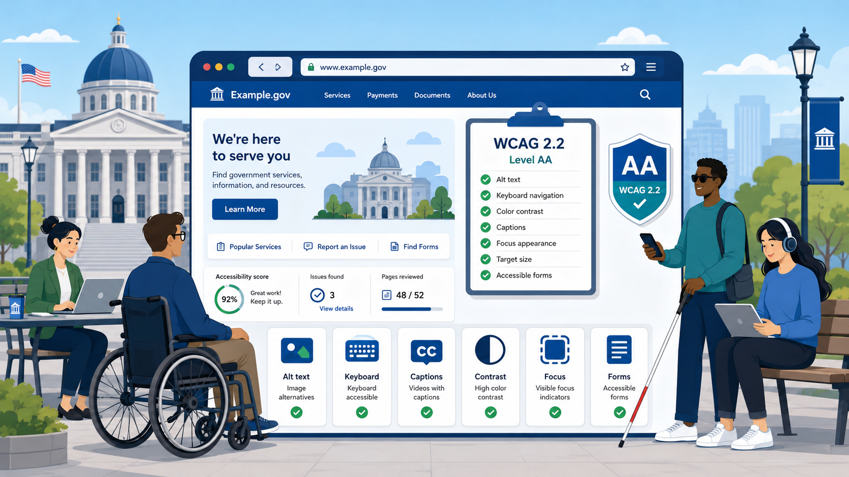
TL;DR: WCAG 2.2 Level AA has 50 success criteria across four principles. This checklist covers each one with plain-language explanations and government-specific examples. Automated tools catch roughly a third of failures — the rest require manual testing.
WCAG 2.2 is the technical standard required by the DOJ’s 2024 final rule for ADA Title II compliance, and it is also the standard referenced by the Department of Education and HHS in their enforcement guidance for programs receiving federal funding. For a deeper explanation of how WCAG relates to Section 508 and ADA Title II, see our comparison guide. If your agency is serious about meeting the April 2026 deadline, you need a concrete understanding of what these 50 success criteria actually require. This checklist is organized by WCAG’s four foundational principles — Perceivable, Operable, Understandable, and Robust — and flags the criteria that are new in version 2.2.
The Four Principles of WCAG
WCAG is built on the POUR model:
- Perceivable — Information and interface components must be presentable to users in ways they can perceive. Blind users cannot see your images; deaf users cannot hear your videos.
- Operable — Interface components and navigation must be operable. A user who cannot use a mouse must still be able to complete a form.
- Understandable — Information and operation of the interface must be understandable. Language must be identified; error messages must be meaningful.
- Robust — Content must be robust enough that it can be interpreted by a wide variety of user agents, including current and future assistive technologies.
Each principle contains guidelines, and each guideline contains testable success criteria at three conformance levels: A (minimum), AA (required by the DOJ rule), and AAA (enhanced). This checklist covers all A and AA criteria.
Section 1: Perceivable
1.1 Text Alternatives
1.1.1 Non-text Content (Level A)
Every image, icon, chart, button image, CAPTCHA, and decorative graphic must have a text alternative. For meaningful images, alt text should convey the purpose or content of the image. Decorative images that add no information should have empty alt attributes (alt="").
Common government failures:
- Department seal images with no alt text or with alt text that just says “image” or the filename
- Charts and graphs in annual reports with no text description of the data
- “Submit” buttons that are images with no alt text
- Photo carousels with missing or generic alt text
How to test: Use a browser’s accessibility tree or run axe DevTools. Visually inspect every image and ask: if this were invisible, would a screen reader user understand what it conveys? For a complete guide to identifying and fixing these failures, see How to Fix Missing Alt Text on a Government Website.
1.2 Time-Based Media
1.2.1 Audio-only and Video-only, Prerecorded (Level A) Prerecorded audio-only content (like a podcast) must have a text transcript. Prerecorded video-only content (like a silent animation) must have either an audio track or a text alternative.
1.2.2 Captions (Prerecorded) (Level A) All prerecorded video with audio must have synchronized captions. Auto-generated captions from YouTube or Zoom do not satisfy this requirement unless reviewed and corrected — auto-captions typically have 10–20% error rates, which is not acceptable for legal or civic content.
1.2.3 Audio Description or Media Alternative (Prerecorded) (Level A) Prerecorded video must provide an audio description of visual information or a text alternative that provides equivalent information.
1.2.4 Captions (Live) (Level AA) Live video content — town hall broadcasts, council meetings, public hearings — must have real-time captions. CART (communication access real-time translation) services or certified live captioning technology is required. This is one of the more technically demanding requirements for governments that stream public meetings.
1.2.5 Audio Description (Prerecorded) (Level AA) Prerecorded video must include audio descriptions of visual information that is not conveyed by the audio track alone. If a speaker says “as you can see in this chart,” a blind user cannot see the chart. Audio descriptions narrate relevant visual content.
1.3 Adaptable
1.3.1 Info and Relationships (Level A)
Information conveyed through visual presentation must also be available programmatically. This means using semantic HTML — headings must use <h1> through <h6>, not bold text styled to look like a heading. Lists must use <ul>, <ol>, or <dl>. Tables used for data must have <th> elements with proper scope attributes.
1.3.2 Meaningful Sequence (Level A) The reading order of content as exposed to assistive technologies must be logical. A screen reader user reading your page in DOM order should encounter content in a sequence that makes sense.
1.3.3 Sensory Characteristics (Level A) Instructions must not rely solely on sensory characteristics like shape, color, size, or position. “Click the red button” or “see the form on the right” fails this criterion.
1.3.4 Orientation (Level AA) Content must not restrict its view and operation to a single display orientation (portrait or landscape) unless a specific orientation is essential. Most government websites do not intentionally lock orientation, but some older CMS templates do.
1.3.5 Identify Input Purpose (Level AA)
Form fields that collect personal information must use HTML autocomplete attributes. A name field must have autocomplete="name", an email field autocomplete="email", etc. This supports users of password managers and users who rely on browser autofill due to motor disabilities.
1.4 Distinguishable
1.4.1 Use of Color (Level A) Color must not be the only means of conveying information. If your form validation marks errors by turning the field border red, that information is not available to users with color vision deficiencies. You must also convey errors through text, icons, or other non-color means.
1.4.2 Audio Control (Level A) If audio plays automatically for more than 3 seconds, users must be able to pause, stop, or control the volume independently of the system volume.
1.4.3 Contrast (Minimum) (Level AA) Text must have a contrast ratio of at least 4.5:1 against its background. Large text (18pt or 14pt bold) requires at least 3:1. This is one of the most commonly failed criteria on government websites, particularly in navigation menus, footer areas, and header text overlaid on images.
Use a contrast checker tool (WebAIM Contrast Checker, Colour Contrast Analyser) to verify each text/background combination. Do not rely on eye judgment.
1.4.4 Resize Text (Level AA) Text must be resizable up to 200% without requiring a special accessibility mode and without loss of content or functionality. Users should be able to resize text using browser settings, not just page zoom.
1.4.5 Images of Text (Level AA) Text should be rendered as actual text, not as images of text, unless the visual presentation is essential (such as a logo). PDFs scanned from paper documents are a chronic failure point here.
1.4.10 Reflow (Level AA) Content must reflow to a single column without horizontal scrolling when the viewport is set to 320px wide (equivalent to 400% zoom on a 1280px monitor). Content must not require scrolling in two dimensions. This primarily affects mobile users and users who zoom significantly.
1.4.11 Non-text Contrast (Level AA) User interface components (form fields, buttons, checkboxes) and informational graphics must have a contrast ratio of at least 3:1 against adjacent colors. A text input box with a light gray border on a white background almost certainly fails this requirement.
1.4.12 Text Spacing (Level AA) Content must remain readable when users override the following CSS properties: line height to 1.5 times the font size, letter spacing to 0.12 times the font size, word spacing to 0.16 times the font size, and spacing after paragraphs to 2 times the font size. Some users with dyslexia rely on custom spacing stylesheets.
1.4.13 Content on Hover or Focus (Level AA) Tooltip-style content that appears on hover or keyboard focus must be dismissible (without moving focus), hoverable (the user can move the mouse to the tooltip without it disappearing), and persistent (it stays visible long enough to read).
Section 2: Operable
2.1 Keyboard Accessible
2.1.1 Keyboard (Level A) All functionality must be operable through a keyboard interface. This means every interactive element — navigation menus, dropdown filters, date pickers, map interfaces, interactive forms — must work without a mouse. Custom JavaScript components are the most common failure point.
2.1.2 No Keyboard Trap (Level A) If keyboard focus moves into a component, users must be able to move focus away using standard key navigation. Modal dialogs are a frequent trap: if the Escape key does not close the dialog and return focus to the triggering element, users relying on keyboard are stuck.
2.1.4 Character Key Shortcuts (Level A) If the site implements single-character keyboard shortcuts, users must be able to turn them off, remap them, or ensure they only activate when the relevant component has focus. This prevents conflicts with screen reader shortcuts.
2.2 Enough Time
2.2.1 Timing Adjustable (Level A) If content has a time limit, users must be able to turn it off, adjust it, or extend it. Session timeouts on permit applications or benefit enrollment portals must give users sufficient warning and opportunity to extend their session.
2.2.2 Pause, Stop, Hide (Level A) Moving, blinking, or scrolling content that lasts more than five seconds must have a control to pause, stop, or hide it. This includes animated carousels, news tickers, and auto-advancing slideshows.
2.3 Seizures and Physical Reactions
2.3.1 Three Flashes or Below Threshold (Level A) Pages must not contain content that flashes more than three times per second unless the flash is below the general flash and red flash thresholds. This is a safety requirement for users with photosensitive epilepsy.
2.4 Navigable
2.4.1 Bypass Blocks (Level A) A mechanism must exist to skip over repeated navigation blocks and go directly to the main content. A “Skip to main content” link at the top of the page satisfies this requirement. It must be either always visible or visible on keyboard focus — hiding it offscreen entirely so sighted keyboard users cannot see it when it receives focus is a common failure.
2.4.2 Page Titled (Level A) Each page must have a title that describes its topic or purpose. Titles like “Home - City of Springfield” are acceptable; titles of “Page 1” or identical titles across all pages fail this criterion.
2.4.3 Focus Order (Level A) If page order affects meaning or operation, focusable components must receive focus in an order that preserves meaning and operability. Focus must follow a logical reading sequence, not jump unpredictably.
2.4.4 Link Purpose in Context (Level A) The purpose of each link must be determinable from the link text alone or from the link text together with its programmatically determinable context. “Click here” and “Read more” links fail this criterion. Link text must describe the destination or action.
2.4.5 Multiple Ways (Level AA) More than one way must be available to locate a page within a set of pages, such as a site map or search function.
2.4.6 Headings and Labels (Level AA) Headings and labels must describe the topic or purpose of the content they head or label. This is both an HTML structure requirement and a content quality requirement.
2.4.7 Focus Visible (Level AA)
Any keyboard-operable interface must have a visible keyboard focus indicator. Do not remove the browser’s default focus outline with outline: none in CSS without providing a custom focus style that is equally visible.
2.4.11 Focus Not Obscured (Minimum) (Level AA) — New in WCAG 2.2 When a user interface component receives keyboard focus, it must not be entirely hidden by author-created content. Sticky headers and cookie banners that cover focused content fail this requirement. The component need not be fully visible, but it must not be entirely obscured.
2.4.12 Focus Not Obscured (Enhanced) (Level AAA) This is the enhanced version — the entire focused component must be visible. This is AAA, not required by the DOJ rule, but good practice.
2.5 Input Modalities
2.5.1 Pointer Gestures (Level A) All functionality that requires multipoint (pinch, zoom) or path-based gestures (swipe) must also be operable with a single pointer and without a path-based gesture. Interactive maps are a common failure — if zooming the map requires a two-finger pinch with no single-tap alternative, this criterion fails.
2.5.2 Pointer Cancellation (Level A) For functions triggered by a single-pointer, at least one of the following must be true: the down event must not trigger the action; or the up event can be used to complete or abort the action; or the action can be undone.
2.5.3 Label in Name (Level A) For interface components with text labels, the accessible name must contain the visible label text. A button labeled “Submit” must have an accessible name that includes the word “Submit.”
2.5.4 Motion Actuation (Level A) Functionality triggered by device motion (shaking or tilting) must have a user interface alternative, and users must be able to disable the motion response.
2.5.7 Dragging Movements (Level AA) — New in WCAG 2.2 All functionality that uses a dragging movement must also be achievable with a single pointer without dragging. This affects sortable list components, map sliders, range inputs with custom drag handles, and similar interfaces.
2.5.8 Target Size (Minimum) (Level AA) — New in WCAG 2.2 Pointer targets must be at least 24x24 CSS pixels, unless the target has sufficient spacing from adjacent targets, or the size is determined by user agent defaults, or an equivalent alternative is available. This primarily affects small icon buttons, close buttons on modals, and tightly packed navigation links.
Section 3: Understandable
3.1 Readable
3.1.1 Language of Page (Level A)
The primary language of each page must be programmatically identified in the lang attribute of the <html> element. This allows screen readers to use the correct pronunciation rules.
3.1.2 Language of Parts (Level AA)
When content in a different language appears within a page, that section must be identified with a lang attribute. If your city’s website includes a Spanish-language section inline, that text should have lang="es".
3.2 Predictable
3.2.1 On Focus (Level A) Receiving focus on a component must not initiate a change of context — no automatic page navigation, no form submission, no new windows opening. A dropdown menu that opens when an item receives keyboard focus is acceptable; one that immediately navigates to a page is not.
3.2.2 On Input (Level A) Changing a form control’s value must not automatically cause a change of context unless users are warned in advance. Selecting a department from a dropdown should not automatically navigate to a new page.
3.2.3 Consistent Navigation (Level AA) Navigation mechanisms repeated across multiple pages must appear in the same relative order each time they are encountered. The main navigation, search, and footer links must be consistent.
3.2.4 Consistent Identification (Level AA) Components with the same functionality must be identified consistently across pages. If your search icon is labeled “Search” on one page, it must not be labeled “Find” on another.
3.3 Input Assistance
3.3.1 Error Identification (Level A) If an input error is automatically detected, the item in error must be identified and the error described to the user in text. A form that marks an invalid phone number by turning the border red, with no text message, fails this criterion.
3.3.2 Labels or Instructions (Level A) Labels or instructions must be provided when content requires user input. Required fields must be indicated. Date format requirements (“MM/DD/YYYY”) must be stated before the field, not just in placeholder text that disappears when typing begins.
3.3.3 Error Suggestion (Level AA) If an input error is detected and suggestions for correction are known, the suggestion must be provided to the user. “Invalid date format” is insufficient; “Please enter date as MM/DD/YYYY, for example 04/24/2026” is compliant.
3.3.4 Error Prevention (Legal, Financial, Data) (Level AA) For pages that cause legal commitments, financial transactions, or significant data modifications, submissions must be reversible, checkable, or confirmed before finalization. Permit applications and fee payments should allow users to review and confirm before final submission.
3.3.7 Redundant Entry (Level A) — New in WCAG 2.2 Information previously entered by the user that is required again in the same process must be either auto-populated or available for the user to select. A multi-step permit application that asks for the applicant’s address in step one must not require them to re-enter it in step three.
3.3.8 Accessible Authentication (Minimum) (Level AA) — New in WCAG 2.2 Authentication processes must not require cognitive function tests — memorizing passwords, solving puzzles, or recognizing objects — unless an alternative is provided or the test is to recognize objects the user themselves provided. This primarily affects CAPTCHA implementations. If your login page uses an image-based CAPTCHA with no audio alternative and no bypass, this criterion fails.
Section 4: Robust
4.1.1 Parsing (Level A) Note: In WCAG 2.2, this criterion is considered “always satisfied or not applicable” because modern browsers handle HTML parsing errors consistently. It remains formally in the specification but is no longer a distinct testing requirement.
4.1.2 Name, Role, Value (Level A)
For all user interface components, the name and role must be programmatically determinable, and states, properties, and values that can be set by the user must be programmatically settable. Custom widgets — dropdown menus built with <div> elements, custom checkboxes, custom radio buttons — must use ARIA attributes (role, aria-checked, aria-expanded, etc.) correctly. Incorrect ARIA is worse than no ARIA.
4.1.3 Status Messages (Level AA)
Status messages must be programmatically determinable through role or properties so they can be announced by assistive technologies without receiving focus. When a form is submitted successfully and a “Your request has been submitted” message appears, a screen reader must announce it. This requires using ARIA live regions (aria-live, role="status", role="alert") correctly.
How to Use This Checklist
Work through each criterion systematically for each distinct page type — homepage, department page, form page, search results, news archive, embedded map. Government websites typically have 10–15 distinct page templates.
For each criterion:
- Identify all instances on the page that could be affected
- Test using the method appropriate to that criterion
- Document the pass/fail result with screenshots and notes
- Log failures with the specific WCAG criterion number, a description of the issue, and the page URL
What Automated Tools Can and Cannot Catch
Automated accessibility scanning tools — axe, WAVE, Lighthouse, SiteImprove — are valuable but limited. Research consistently shows that automated tools detect approximately 30–40% of WCAG failures.
What automated tools catch reliably:
- Missing alt text on images
- Missing form labels
- Low color contrast ratios
- Missing page
langattribute - Missing page title
- Obvious heading structure violations
What automated tools cannot catch:
- Whether alt text is meaningful (they detect presence, not quality)
- Whether captions are accurate
- Whether keyboard navigation flow is logical
- Whether error messages are helpful
- Whether accessible names match visible labels
- Whether focus indicators are sufficiently visible
- Whether content makes sense when read in DOM order
Manual testing by a qualified accessibility specialist and usability testing with actual users who use assistive technologies are both essential components of a complete audit. Automated scanning is a starting point, not a compliance certification.
Govzu combines automated scanning with structured manual testing protocols to give government agencies a complete and accurate picture of their WCAG 2.2 compliance status. Learn more at govzu.com.